
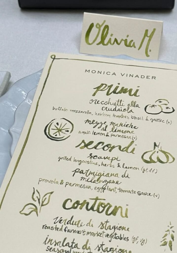
You can skip the runner. You can skip the flowers. What you should not skip, if the dinner is seated, is a name and a menu. Two pieces of cream paper, the same ink, set on a glass plate: that is a tablescape. Everything else is optional.

Write the Name Larger Than the Menu
The place card is the greeting. Make the name big enough to read from standing. A first name and an initial is friendlier than a full formal line. Lean it against a glass, a candle, or the menu itself — it does not need a silver stand.
The menu can be messier. Course names in a looser hand, a leaf or a lemon drawn in the margin, dietary notes if you must. People like knowing what is coming. They like even more that you wrote it for them and not for a stack of strangers.
If the paper matches, the rest of the table is allowed to be quiet.
Let the Plate Be Glass
A scalloped or textured glass charger does the decorating. White linen underneath, no pattern fighting the ink. You see the handwriting, then the plate, then the cloth — three quiet layers instead of a centerpiece you have to talk around.
One ink color for the whole night. Olive, burgundy, or navy. Mix pens and the table starts to look like a stationery shop.
The Two-Card Rule
- A name card in a large hand.
- A menu in the same ink, on the same cream stock.
- A plate interesting enough to photograph — glass, a rim, or a scallop.
Start with Place Setting, keep a stack of cards from Gifts if you want the paper done, and write the names the afternoon before — not at the door.